Planning a website design project
At some point during your working life you will look at your current company website and probably start asking questions about it. Questions such as “when was the last time we refreshed our website design” or “when was the last time we carried out a review of the company website” or maybe more importantly “what does my current website do for my business in terms of online persona, customer journey and my company bottom line”
If you do not have the answers to hand, you probably should, but thats not your fault, and it was probably something that you never thought about when you designed your first, second or possibly your third website! Luckily we have put together 10 handy tips for you to create the ultimate website project brief that a website designer will thank you for!
1. Start by making sketches
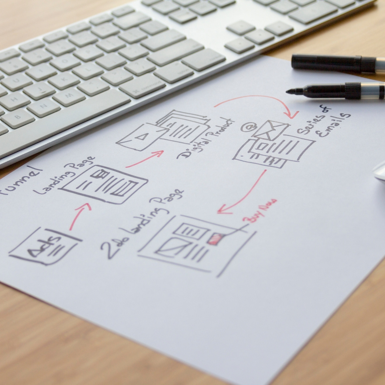
You don’t have to be a highly skilled Graphic Designer or Website Designer to start sketching boxes and squiggles on a piece of A4 paper. Infact, it’s the best place to start. Get all the ideas out of your head on to a piece of paper and watch your new website start to come together. Draw areas for images, text, headings, buttons, and any manner of functionality you wish to see on your website homepage. Trust us, this is a great place to sart as most designers will be able to visualise the layout of the page.
And before you think it, this isn’t just the job of the professional you are employing to do the job, this forges a great understanding between you and your graphically inclined friend, relative, agency, freelancer. It can cut down on quite a bit of guess work and get your project off to a great start by providing a wireframe that a designer can work with, to give you the vision that you already have in mind for your company.


2. Design from a "mobile first" perspective
Get the whiteboard out, find your favorite whiteboard pens, use post it notes, cut up some images, pull together anything you would like to see on your new website and start moving things around. Its easier to do it at this stage than it is after the fact. No developer wants to be constantly making changes to the page layout, functionality, and code for the duration of the project.
Yes, there will be a few adjustments, these are to be expected and usually planned for, but the less adjustments that are needed during the build stage, the less money you will pay for your project to be completed on time and on budget. It may seem like a simple idea, and that’s because the simple ideas are often the best ones, the more robust the build stage of your website design project is…the quicker it will be delivered.
3. Design the desktop view with a different mindset
Now that you have decided what the mobile layout should look like and the information it should contain, its time to think about the desktop version of your website. Most modern websites are responsive from the desktop version to the mobile version. This means that technically the info on the desktop version should resize down to fit a mobile/tablet screen, and whilst this is the case here are a few things to consider. If someone is viewing your site using PC or a Laptop you can show a bit more information. Information that sometimes isn’t needed on the mobile version, such as landscape image sliders and galleries, some functionality that isn’t needed or relevant on a mobile phone.
The mobile version of your site should be used to “get straight to the point” where the desktop version can be more story led, building the impression of your business that you would like people to engage with. Keep an open mind as to what the desktop version and the mobile version of your site should look like and how it should function.
4. What about the additional pages on your site?
Most of the time you may only be interested in how your homepage looks, and how it functions. But remember, this is only one page, or as a search engine sees it “one door” or as a marketing expert sees it ”one opportunity” or as a designer sees it “90% of the project” (that last one was a joke…or was it!)
Every subsequent page you add to your website should be designed with the same flow of information and goal in mind, otherwise why would we need to create the “about us page” or additional services pages. Treat your additional pages as landing pages, a mini homepage, a conversion tool, and just as important, another opportunity to deliver your business goals. Make sure that each individual page has an individual message, goal, and purpose. If you start thinking of additional pages with this mindset your website will act more like a lead generation tool rather than a bunch of pretty pictures and information published to the internet that no one takes any action on.
Our advice, treat all pages on your website equally, with the same enthusiasm and planning as your homepage.
5. Have your page content prepared
One of the things that really hold up a website design project is waiting on the images and text to be supplied by clients. Most of the time a client will say “just use the content from the old site” our opinion on this is “if the content was delivering results, we wouldn’t be looking at reworking the current site”
If you find that writing copy is time consuming, difficult, or if you just don’t know where to start, there are options for you. Work with a copy writer, work with your designer (they deal with copy every day of the week and can be a great source of advice) work with a marketing person who can take copy you have already written and add that little bit of extra marketing spin to it.
Also have a bank of images prepared, again, whether you have purchased images, used a professional photographer, taken your own or if you use supplier images. Having your image folder ready to hand over to the designer will make the initial designs feel more like your company vision is taking shape. Looking for images that are suitable for a project can be a time consuming job for your designer, so have everything prepared.
If you have social networks and videos make the designer aware of this as they can use these channels to research what you are already doing. Provide links to all social channels and watch your new website design take shape!
6. Lets consider your website's functionality
Ok, now that we have planned the look and feel of the website on mobile and desktop versions, prepared all of our content and we have a few prototype wireframes and designs started let’s think about functionality.
When you think about functionality think about your website user. What happens when an image comes into view, how do the headings on the page work, where will the call to action button be placed (more on this later) How do other “moving parts” of the page work? Your designer will help with this, but it would also be a good idea if you had some thoughts on how these things will work. Do you have a newsletter sign up? When does the pop up appear? You can have it set to appear after a certain amount of time, or a certain amount of page clicks. Are you using live chat on your website? Again, when does the live chat button become available? As soon as a user hits the site, after 3 page clicks, on certain pages only? All functionality questions that need to be answered to produce a website with functionality that serves the right type of user experience on your website. Consider these functionality factors and people will return to your site for more information time and time again.
7. Here's a quick lesson on page optimisation
There are a few basic things you can do right at the start of your content preparation and page creation stage, and that’s optimise the content that you already have so that your new site gets off to the best possible start in terms of organic indexing on a search engine.
Your page title should reflect the nature of the page content. Don’t have a page titled “Zoo Keeper Services” and it doesn’t reflect the page content about “Animal Nutrition” (yip…totally random thought there) Be specific!
Make sure you have relevant meta tags and meta descriptions. These are the snippets of text that a search engine will present to the user when your page shows up on a search engine results page (SERP) This helps the user make a decision on whether to click your link or someone elses.
Page copy (words) should be around 600 words minimum. This helps a search engine see your content as relevant. Make sure your page content also has a link to another page within your website.
Any images you use on your page should have “Alt-Tags” that reflect one or more keywords and phrases from your page content. Again this helps a search engine index your page and mark it as “relevant”
We have a Content Checklist that you can download and keep for when you are creating and optimizing page content.
8. Make your site users complete a "Call To Action"
Every single page you create on your website should have a Call To Action (CTA) even your “About Us” page should have a call to action, something that you need your site user to carry out in order for your business goal to be achieved. It could be as simple as “Contact Us” or “Find Out More” but whatever it is, it should always be present. If your user journey is considered and streamlined to the point where they act quickly you will see your key business metrics improve over time.
See that button above this section? That’s a call to action. We want you to download our content checklist for free. Why? Because you will love it, and if you love our free stuff, you’ll come back for more and if you come back for more you are more likely to pick up the phone or send us a message to discuss further projects! P.S – there’s also a call to action at the bottom of this page (wink emoji)
So, when you are creating your content pages remember this – Always have a call to action. You have worked hard to get someone to your website, they have read your amazing content and now what? Don’t let “Now what” become a question on your website.
9. Test, Test, Test and Test again!
This is a very important part. When your site has been designed, all content placed on the relevant pages, all functionality considered, call to action implemented on every page, pages optimised and you now have a launch date for your site (P.S never launch a site on a Friday unless its absolutely necessary)
Now, go test your site on all device layouts, see how it all flows and functions. Is everything working as it should? Go test your webforms and call to action buttons. Is everything going where it needs to go? Would you be happy right now to launch the site? Well sit back for 24hrs and then test everything again, did you test every page link, did you check the contact details on the contact page? Does the site still meet the same functionality as it did yesterday? Then hit that launch button (there is no launch button) your designer/developer will do all the necessary work by changing a few settings on your domain, this will now be a 24hr process for the new site to appear all over the internet. When the site is live don’t tell anyone (just yet) test it again.
If you are 100% happy with what you are seeing you can now pop over to your social channels, email list, newsletter (whatever you are using to market to your current audience) and let them know that the new shiny website is just sitting ready for their undivided attention.
Ok..we get it, that was only 9 tips!
The 10th tip is practice what you preach! If you are creating content on your website make sure its relevant to the people you want to read it. Lets face it, you made it this far down the page, and lets be honest, it was because you enjoyed reading it. Your new website should be set up with all of your awesome content that you can now share with your current customers, clients, target audience…hell, even your employees might be proud to show it to their friends and family. So before you launch that brand spanking, optimised, content driven beast that you have just created…stop and ask yourself just one last question – “Do I feel proud to share this?” and if the answer is “yes” then you have our permission to sow your contented seeds all across the interwebs! Seriously…we dont mind!


